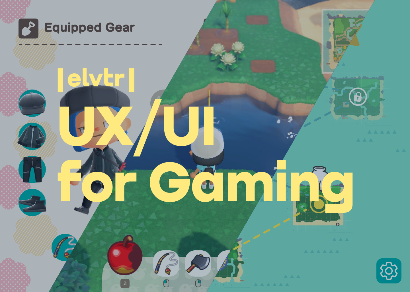
ELVTR - UX/UI in Gaming Coursework
Overview:
A study of the game, Minecraft Dungeons, to further understand UX/UI practices in a gaming context. Project completed as a part of ELVTR’s UX/UI in Gaming course.
Task:
UX/UI Design, User Testing
Tools:
Figma, Illustrator, Photoshop
Project Length:
7 Weeks
Challenges
Short time span
Limited access to art resources
Limited knowledge of established game rules
Design references were very vast and hard to pin down
UX Design
Player Journey
Paper Prototype & Flow Chart
Wireframes & Iterations


User Testing Results Notes:
Player was initially confused about which locations were currently available to them.
Locked and Unlocked locations need to be made clearer
Player was unsure about the correlation between levels
Make the distinction between “Current Player’s lvl” and difficulty level more clear
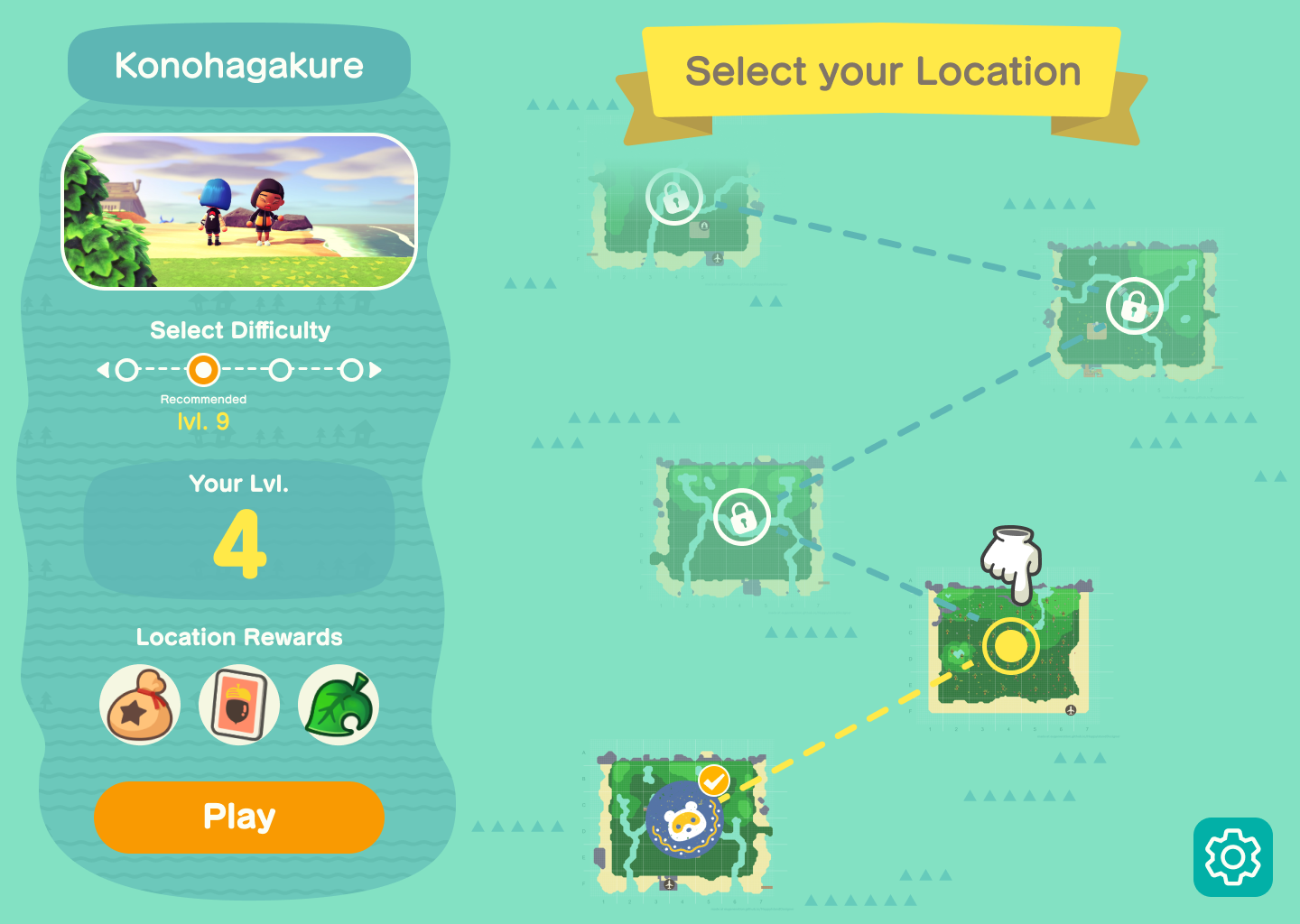
Iterated Wireframe

UI Design
After designing the wireframe for our assignment, we were allowed to choose the UI style. I chose our quarantine favorite, Animal Crossing: New Horizons.
Mood Board
Animal Crossing: New Horizons (Nintendo)
Screenshots sourced from gameuidatabase.com and interfaceingame.com/
Style Guide

I closely studied Animal Crossing’s UI to get an understanding of how they use colors, shapes, and typography.
This was a bit of a challenge since every screen seemed to use a different set of primary colors.
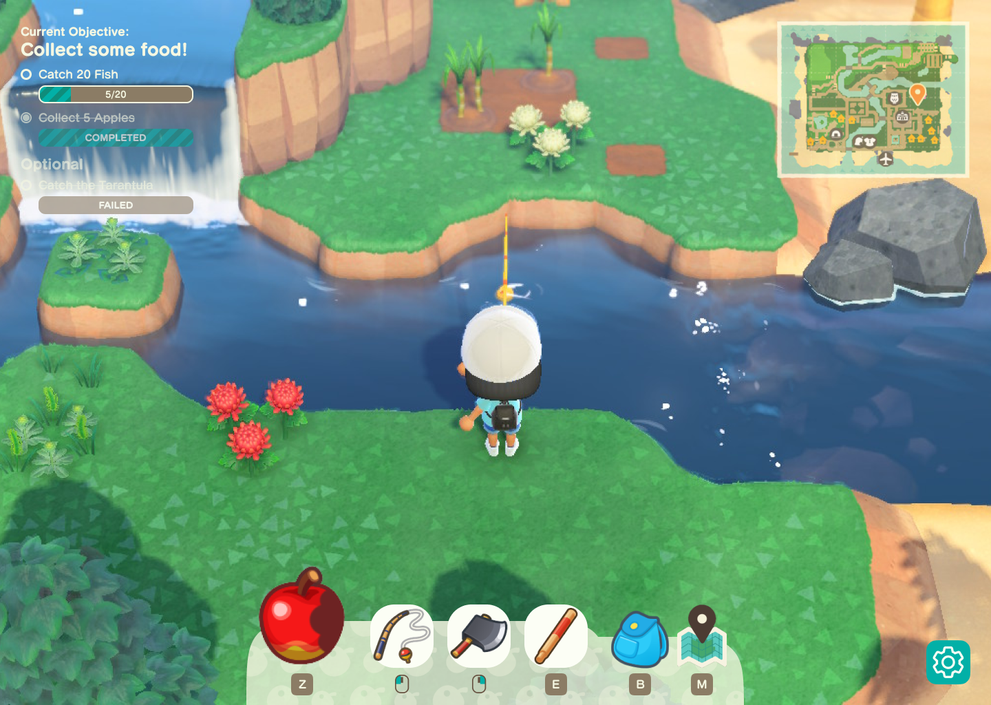
Mock-Ups
Outcomes
Gained a deeper understanding of the process behind applying another brand’s style in other contexts
Learned how to work within a short time limit with very limited resources
Further understood how to apply UX/UI practices in a gaming context with the addition of a game designer in the mix
Post-Mortem
This project was a great exercise for me to understand UX/UI in a gaming context. I would love to revisit this in the future with more time for user-testing, dialing in on art assets, and creating more screens.


