Springboard Capstone Project
Overview:
A tool for Vegas locals to navigate The Strip and create an experience for themselves.
Task:
User Research, UX/UI Design, and User Testing
Year:
2019-2020
Defining the Problem:
Vegas locals enjoy The Strip for a high quality experience they can’t find anywhere else in the city. They want to discover new things on The Strip and craft an experience for themselves. However, just like any popular tourist destination, being on The Strip often comes with having to deal with traffic, crowds of tourists, and the recently dreaded parking fees.
My Goal:
How might we allow a Vegas local to create their Vegas Strip experience, while avoiding the problems that come with being in a popular tourist destination?
My Role:
As this is my capstone project for Springboard, I was doing this solo. I was tasked with conducting the user research, creating the design (user journey, wireframes, mockups,) and conducting the usability test sessions.
User Interviews
My first step was to understand our users. I conducted 5 interviews with Vegas locals who visit The Strip recreationally 1-2 times a month. I wanted to learn the following:
Why do they visit The Strip, and what do they enjoy about being there
How do they avoid the traffic in the area
How do they find new places on The Strip
Is fee parking important to them? (The Strip initially had free parking in all casinos, but introduced paid parking in 2016.)
I learned the following:
They enjoy going to The Strip for a high quality experience, and they’ll take the time to peruse and explore The Strip
Some interviewees will research and create a plan of the places they’ll want to go
They all had their own driving routes to avoid the traffic on The Strip
They had to learn on their own what the “peak hours” of The Strip were, and avoided going during those hours.
Free parking is ideal, but if it isn’t near their desired casino, they’ll decide to pay for parking.
User Persona
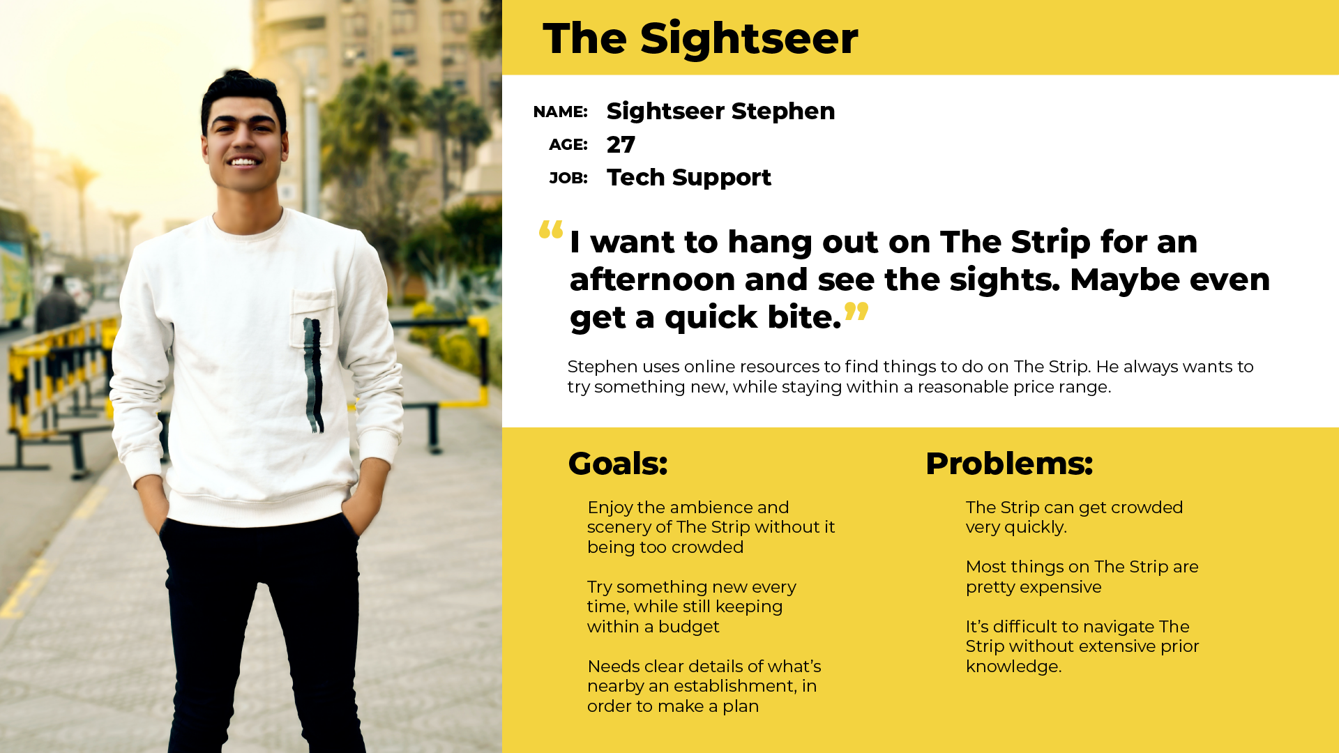
Our user persona, Stephen. He just wants to hang out on The Strip
Using what I learned from my user interviews, I took bits, pieces, and similarities between my interviewees and created our user persona. I stepped into Stephen’s shoes, and thought about what he would do to help him accomplish his goals and how he would solve his problems. I then used these insights to create a User Story.
User Story
Creating the user story allowed me to better flesh out the features and capabilities of my project. I had several ideas, but I had to narrow it down to features that best aligned with Stephen’s goals. As this was a short project, I decided to focus on the user creating an itinerary, and adding a restaurant they intend to visit.
Visualizing the User Workflow
User Map. This is the map I had before I further narrowed down the scope of the project.
With that decided, I created a workflow to understand how a user would go about the seemingly simple task of searching up a restaurant and adding it to a new itinerary. I then began creating the screens for the project.
Sketches
Wireframe Sketches
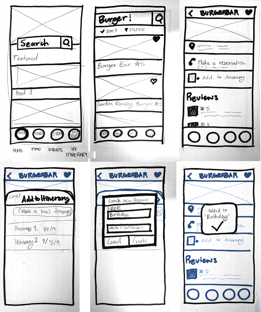
I started with sketches to get a better idea of a layout before I went digital. I also conducted some quick usability tests with these screens.
Guerilla Test Results:
Users were tasked with finding and adding the restaurant, “Burger Bar,” to an itinerary. The tests were very successful with all the participants completing the task. However, my sketches didn’t account for the different routes that users would take. I chose to move forward with the layout of the screens, but add more options to account for different routes.
Wireflows
As the main problem was that I didn’t account for all the routes, I found myself constantly referencing the previous user map to help me understand what screens I would need to create. I also made my wireframes into a wireflow to give myself an idea of what the user will be interacting with to get to the next step. This also came in handy when creating my high-fidelity prototype.
Style Guide
I wanted to have a very bright color palette to emulate the bright lights of the Vegas Strip. I also chose to have simple line iconography with open ends as if to mirror the neon signs that are often associated with old Vegas.
High-Fidelity Mock Ups
View the prototype here!
I did 2 rounds of testing with the high-fidelity mockups. The first test brought up some contrast issues in the brown on yellow navigation and the pink on white background. I ended up increasing the contrast of the icons in the navigation, and darkening the pink color.
The second test showed that some users were initially confused in the “Add to an Itinerary” section. They weren’t sure if the itineraries listed were pre-existing. I remedied this by adding a small plus button.
Learnings and Retrospect
I often found myself thinking about extra things I could add that would make my project “better.” This often led me to become overwhelmed with ideas of how I could possibly finish my project. However, if given the opportunity, I’d love to be able to add more functionality to the itinerary to help the user navigate from one item on the itinerary to another.


